Tuesday 25 July 2017

Experiment designs for Agriculture

This post is more for personal use than anything else. It is just a collection of code and functions to produce some of the most used experimental designs in agriculture and animal science. 

I will not go into details about these designs. If you want to know more about what to use in which situation you can find material at the following links:

Design of Experiments (Penn State): https://onlinecourses.science.psu.edu/stat503/node/5

Statistical Methods for Bioscience (Wisconsin-Madison): http://www.stat.wisc.edu/courses/st572-larget/Spring2007/

R Packages to create several designs are presented here: https://cran.r-project.org/web/views/ExperimentalDesign.html

A very good tutorial about the use of the package Agricolae can be found here:
https://cran.r-project.org/web/packages/agricolae/vignettes/tutorial.pdf


Complete Randomized Design

This is probably the most common design, and it is generally used when conditions are uniform, so we do not need to account for variations due for example to soil conditions. 
In R we can create a simple CRD with the function expand.grid and then with some randomization:

 TR.Structure = expand.grid(rep=1:3, Treatment1=c("A","B"), Treatment2=c("A","B","C"))  
 Data.CRD = TR.Structure[sample(1:nrow(TR.Structure),nrow(TR.Structure)),]  
   
 Data.CRD = cbind(PlotN=1:nrow(Data.CRD), Data.CRD[,-1])  
   
 write.csv(Data.CRD, "CompleteRandomDesign.csv", row.names=F)  

The first line create a basic treatment structure, with rep that identifies the number of replicate, that looks like this:

 > TR.Structure  
   rep Treatment1 Treatment2  
 1  1     A     A  
 2  2     A     A  
 3  3     A     A  
 4  1     B     A  
 5  2     B     A  
 6  3     B     A  
 7  1     A     B  
 8  2     A     B  
 9  3     A     B  
 10  1     B     B  
 11  2     B     B  
 12  3     B     B  
 13  1     A     C  
 14  2     A     C  
 15  3     A     C  
 16  1     B     C  
 17  2     B     C  
 18  3     B     C  
   

The second line randomizes the whole data.frame to obtain a CRD, then we add with cbind a column at the beginning with an ID for the plot, while also eliminating the columns with rep.


Add Control

To add a Control we need to write two separate lines, one for the treatment structure and the other for the control:

 TR.Structure = expand.grid(rep=1:3, Treatment1=c("A","B"), Treatment2=c("A","B","C"))  
 CR.Structure = expand.grid(rep=1:3, Treatment1=c("Control"), Treatment2=c("Control"))  
   
 Data.CCRD = rbind(TR.Structure, CR.Structure)  

This will generate the following table:

 > Data.CCRD  
   rep Treatment1 Treatment2  
 1  1     A     A  
 2  2     A     A  
 3  3     A     A  
 4  1     B     A  
 5  2     B     A  
 6  3     B     A  
 7  1     A     B  
 8  2     A     B  
 9  3     A     B  
 10  1     B     B  
 11  2     B     B  
 12  3     B     B  
 13  1     A     C  
 14  2     A     C  
 15  3     A     C  
 16  1     B     C  
 17  2     B     C  
 18  3     B     C  
 19  1  Control  Control  
 20  2  Control  Control  
 21  3  Control  Control  
   

As you can see the control is totally excluded from the rest. Now we just need to randomize, again using the function sample:

 Data.CCRD = Data.CCRD[sample(1:nrow(Data.CCRD),nrow(Data.CCRD)),]  
   
 Data.CCRD = cbind(PlotN=1:nrow(Data.CCRD), Data.CCRD[,-1])  
   
 write.csv(Data.CCRD, "CompleteRandomDesign_Control.csv", row.names=F)  


Block Design with Control

The starting is the same as before. The difference starts when we need to randomize, because in CRD we randomize over the entire table, but with blocks, we need to do it by block.

 TR.Structure = expand.grid(Treatment1=c("A","B"), Treatment2=c("A","B","C"))  
 CR.Structure = expand.grid(Treatment1=c("Control"), Treatment2=c("Control"))  
   
 Data.CBD = rbind(TR.Structure, CR.Structure)  
   
 Block1 = Data.CBD[sample(1:nrow(Data.CBD),nrow(Data.CBD)),]  
 Block2 = Data.CBD[sample(1:nrow(Data.CBD),nrow(Data.CBD)),]  
 Block3 = Data.CBD[sample(1:nrow(Data.CBD),nrow(Data.CBD)),]  
   
 Data.CBD = rbind(Block1, Block2, Block3)  
   
 BlockID = rep(1:nrow(Block1),3)  
   
 Data.CBD = cbind(Block = BlockID, Data.CBD)  
   
 write.csv(Data.CBD, "BlockDesign_Control.csv", row.names=F)  

As you can see from the code above, we've created three objects, one for each block, where we used the function sample to randomize.


Other Designs with Agricolae

The package agricolae includes many designs, which I am sure will cover all your needs in terms of setting up field and lab experiments.
We will look at some of them, so first let's install the package:

 install.packages("agricolae")  
 library(agricolae)  
   

The main syntax for design in agricolae is the following:

 Trt1 = c("A","B","C")  
 design.crd(trt=Trt1, r=3)  

The result is the output below:

 > design.crd(trt=Trt1, r=3)  
 $parameters  
 $parameters$design  
 [1] "crd"  
   
 $parameters$trt  
 [1] "A" "B" "C"  
   
 $parameters$r  
 [1] 3 3 3  
   
 $parameters$serie  
 [1] 2  
   
 $parameters$seed  
 [1] 1572684797  
   
 $parameters$kinds  
 [1] "Super-Duper"  
   
 $parameters[[7]]  
 [1] TRUE  
   
   
 $book  
  plots r Trt1  
 1  101 1  A  
 2  102 1  B  
 3  103 2  B  
 4  104 2  A  
 5  105 1  C  
 6  106 3  A  
 7  107 2  C  
 8  108 3  C  
 9  109 3  B  
   

As you can see the function takes only one argument for treatments and another for replicates. Therefore, if we need to include a more complex treatment structure we first need to work on them:

 Trt1 = c("A","B","C")  
 Trt2 = c("1","2")  
 Trt3 = c("+","-")  
   
 TRT.tmp = as.vector(sapply(Trt1, function(x){paste0(x,Trt2)}))  
 TRT = as.vector(sapply(TRT.tmp, function(x){paste0(x,Trt3)}))  
 TRT.Control = c(TRT, rep("Control", 3))  

As you can see we have now three treatments, which are merged into unique strings within the function sapply:

 > TRT  
  [1] "A1+" "A1-" "A2+" "A2-" "B1+" "B1-" "B2+" "B2-" "C1+" "C1-" "C2+" "C2-"  

Then we need to include the control, and then we can use the object TRT.Control with the function design.crd, from which we can directly obtain the data.frame with $book:

 > design.crd(trt=TRT.Control, r=3)$book  
   plots r TRT.Control  
 1  101 1     A2+  
 2  102 1     B1+  
 3  103 1   Control  
 4  104 1     B2+  
 5  105 1     A1+  
 6  106 1     C2+  
 7  107 2     A2+  
 8  108 1     C2-  
 9  109 2   Control  
 10  110 1     B2-  
 11  111 3   Control  
 12  112 1   Control  
 13  113 2     C2-  
 14  114 2   Control  
 15  115 1     C1+  
 16  116 2     C1+  
 17  117 2     B2-  
 18  118 1     C1-  
 19  119 2     C2+  
 20  120 3     C2-  
 21  121 1     A2-  
 22  122 2     C1-  
 23  123 2     A1+  
 24  124 3     C1+  
 25  125 1     B1-  
 26  126 3   Control  
 27  127 3     A1+  
 28  128 2     B1+  
 29  129 2     B2+  
 30  130 3     B2+  
 31  131 1     A1-  
 32  132 2     B1-  
 33  133 2     A2-  
 34  134 1   Control  
 35  135 3     C2+  
 36  136 2   Control  
 37  137 2     A1-  
 38  138 3     B1+  
 39  139 3   Control  
 40  140 3     A2-  
 41  141 3     A1-  
 42  142 3     A2+  
 43  143 3     B2-  
 44  144 3     C1-  
 45  145 3     B1-  
   

A note about this design is that, since we repeated the string "Control" 3 times when creating the treatment structure, the design basically has additional repetition for the control. If this is what you want to do fine, otherwise you need to change from:

TRT.Control = c(TRT, rep("Control", 3)) 

to:

TRT.Control = c(TRT, "Control") 

This will create a design with 39 lines, and 3 controls.


Other possible designs are:

 #Random Block Design  
 design.rcbd(trt=TRT.Control, r=3)$book  
   
 #Incomplete Block Design  
 design.bib(trt=TRT.Control, r=7, k=3)  
   
 #Split-Plot Design  
 design.split(Trt1, Trt2, r=3, design=c("crd"))  
   
 #Latin Square  
 design.lsd(trt=TRT.tmp)$sketch  

Others not included above are: Alpha designs, Cyclic designs, Augmented block designs, Graeco - latin square designs, Lattice designs, Strip Plot Designs, Incomplete Latin Square Design


Update 26/07/2017 - Plotting your Design

Today I received an email from Kevin Wright, creator of the package desplot.
This is a very cool package that allows you to plot your design with colors and text, so that it becomes quite informative for the reader. On the link above you will find several examples on how to plot designs for existing datasets. In this paragraph I would like to focus on how to create cool plots when we are designing our experiments.
Let's look at some code:

 install.packages("desplot")  
 library(desplot)  
 
#Complete Randomized Design  
 CRD = design.crd(trt=TRT.Control, r=3)$book  
 CRD = CRD[order(CRD$r),]  
 CRD$col = CRD$r  
 CRD$row = rep(1:13,3)  
 
desplot(form=TRT.Control ~ col+row, data=CRD, text=TRT.Control, out1=col, out2=row,   
      cex=1, main="Complete Randomized Design")  

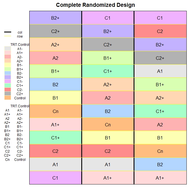
After installing the package desplot I created an example for plotting the comple randomized design we created above.

To use the function desplot we first need to include in the design columns and rows, so that the function knows what to plot and where. For this I first ordered the data.frame based on the column r, which stands for replicates. Then I added a column named col, with values equal to r (I could use the column r, but I wanted to make clear the procedure), and another named row. Here I basically repeated a vector from 1 to 13 (which is the total number of treatments per replicate), 3 times (i.e. the number of replicates).

The function desplot returns the following plot, which I think is very informative:


We could do the same with the random block design:

 #Random Block Design  
 RBD = design.rcbd(trt=TRT.Control, r=6)$book  
 RBD = RBD[order(RBD$block),]  
 RBD$col = RBD$block  
 RBD$row = rep(1:13,6)  
   
 desplot(form=block~row+col, data=RBD, text=TRT.Control, col=TRT.Control, out1=block, out2=row, cex=1, main="Randomized Block Design")  
   

thus obtaining the following image:


Final Note

For repeated measures and crossover designs I think we can create designs simply using again the function expand.grid and including time and subjects, as I did in my previous post about Power Analysis. However, there is also the package Crossover that deals specifically with crossover design and on this page you can find more packages that deal with clinical designs: https://cran.r-project.org/web/views/ClinicalTrials.html

Friday 21 July 2017

Power analysis and sample size calculation for Agriculture

Power analysis is extremely important in statistics since it allows us to calculate how many chances we have of obtaining realistic results. Sometimes researchers tend to underestimate this aspect and they are just interested in obtaining significant p-values. The problem with this is that a significance level of 0.05 does not necessarily mean that what you are observing is real.
In the book "Statistics Done Wrong" by Alex Reinhart (which you can read for free here: https://www.statisticsdonewrong.com/) this problem is discussed with an example where we can clearly see that a significance of 0.05 does not mean that we have 5% chances of getting it wrong, but actually we have closer to 30% chances of obtaining unrealistic results. This is because there are two types of errors in which we can incur (for example when performing an ANOVA), the type I (i.e. rejecting a null hypothesis when it is actually true) and type II (i.e. accepting a null hypothesis when it is actually false).

Image taken from: https://datasciencedojo.com/

The probability of incurring in a type I error is indicated by α (or significance level) and usually takes a value of 5%; this means that we are happy to consider a scenario where we have 5% chances of rejecting the null hypothesis when it is actually true. If we are not happy with this, we can further decrease this probability by decreasing the value of α (for example to 1%). On the contrary the probability of incurring in a type II error is expressed by β, which usually takes a value of 20% (meaning a power of 80%). This means we are happy to work assuming that we have a 20% chance of accepting the null hypothesis when it is actually false.
If our experiment is not designed properly we cannot be sure whether we actually incurred in one of these two errors. In other words, if we run a bad experiment and we obtain a insignificant p-value it may be that we incurred in a type II error, meaning that in reality our treatment works but its effect cannot be detected by our experiment. However, it may also be that we obtained a significant p-value but we incurred in a type I error, and if we repeat the experiment we will find different results.
The only way we can be sure to run a good experiment is by running a power analysis. By definition power is the probability of obtaining statistical significance (not necessarily a small p-value, but at least a realistic outcome). Power analysis can be used before an experiment to test whether our design has good chances of succeeding (a priori) or after to test whether the results we obtained were realistic.


Update 17/11/2017
How many subjects to compute a robust mean?

This is a question that I get sometimes when talking with students that are planning descriptive experiments. How many subjects do I need for the mean value I compute to be robust?

The answer is provided by Berkowitz here: www.columbia.edu/~mvp19/RMC/M6/M6.doc

The simplified formula to compute the minimum number of samples is:


where SD is the standard deviation and SE is the standard error. These values can be obtained from previous experiments, or from the literature. 

Effect Size

A simple and effective definition of effect size is provided in the book "Power Analysis for Experimental Research" by Bausell & Li. They say: 
"effect size is nothing more than a standardized measure of the size of the mean difference(s) among the study’s groups or of the strength of the relationship(s) among its variables".

Despite its simple definition the calculation of the effect size is not always straightforward and many indexes have been proposed over the years. Bausell & Li propose the following definition, in line with what proposed by Cohen in his "Statistical Power Analysis for the Behavioral Sciences":

where ES is the effect size (in Cohen this is referred as d). In this equation, Ya is the mean of the measures for treatment A, and Yb is the mean for treatment B. The denominator is the pooled standard deviation, which is computed as follows:


where SD are the standard deviation for treatments B and A, and n are the number of samples for treatment B and A.

This is the main definition but then every software or functions tend to use indexes correlated to this but not identical. We will see each way of calculating the effect size case by case.


One-Way ANOVA 

Sample size

For simple models the power calculating can be performed with the package pwr:

 library(pwr)  

In the previous post (Linear Models) we worked on a dataset where we tested the impact on yield of 6 levels of nitrogen. Let's assume that we need to run a similar experiment and we would like to know how many samples we should collect (or how many plants we should use in the glass house) for each level of nitrogen. To calculate this we need to do a power analysis.

To compute the sample size required to reach good power we can run the following line of code:

 pwr.anova.test(k=6, f=0.25, sig.level=0.05, power=0.8)  

Let's start describing the options from the end. We have the option power, to specify the power you require for your experiment. In general, this can be set to 0.8, as mentioned above. The significance level is alpha and usually we are happy to accept a significance of 5%. Another option is k, which is the number of groups in our experiment, in this case we have 6 groups.
Finally we have the option f, which is the effect size. As I mentioned above, there are many indexes to express the effect size and f is one of them.
According to Cohen, f can be expressed as:


where the numerator is the is the standard deviation of the effects that we want to test and the denominator is the common standard deviation. For two means, as in the equation we have seen above, f is simply equal to:


Clearly, before running the experiment we do not really know what the effect size would be. In some case we may have an idea, for example from previous experiments or a pilot study. However, most of the times we do not have a clue. In such cases we can use the classification suggested by Cohen, who considered the following values for f:

The general rule is that if we do not know anything about our experiment we should use a medium effect size, so in this case 0.25. This was suggested in the book Bausell & Li and it is based on a review of 302 studies in the social and behavioral sciences. for this reason it may well be that the effect size of your experiment would be different. However, if you do not have any additional information this is the only thing the literature suggest.

The function above returns the following output:

 > pwr.anova.test(k=6, f=0.25, sig.level=0.05, power=0.8)  
    Balanced one-way analysis of variance power calculation   
        k = 6  
        n = 35.14095  
        f = 0.25  
    sig.level = 0.05  
      power = 0.8  
 NOTE: n is number in each group  

In this example we would need 36 samples for each nitrogen level to achieve a power of 80% with a significance of 5%.


Power Calculation

As I mentioned above, sometimes we have a dataset we collected assuming we could reach good power but we are not actually sure if that is the case. In those instances what we can do is the a posteriori power analysis, where we basically compute the power for a model we already fitted.

As you remember is the previous post about linear models, we fitted the following:

 mod1 = aov(yield ~ nf, data=dat)  

To compute the power we achieved here we first need to calculate the effect size. As discussed above we have several options: d, f and another index called partial eta squared.
Let's start from d, which can be simply calculated using means and standard deviation of two groups, for example N0 (control) and N5:

 Control = dat[dat$nf=="N0","yield"]
 Treatment1 = dat[dat$nf=="N5","yield"]

 numerator = (mean(Treatment1)-mean(Control))
 denominator = sqrt((((length(Treatment1)-1)*sd(Treatment1)^2)+((length(Control)-1)*sd(Control)^2))/(length(Treatment1)+length(Control)-2))

 d = numerator/denominator

This code simply computes the numerator (difference in means) and the denominator (pooled standard deviation) and then computes the Cohen's d, you just need to change the vectors for objects Control and Treatment1. The effect size results in 0.38.

Again Cohen provides some values for the d, so that we can determine how large is our effects, which are presented below:

From this table we can see that our effect size is actually low, and not medium as we assumed for the a priori analysis. This is important because if we run the experiment with 36 samples per group we may end up with unrealistic results simply due to low power. For this reason it is my opinion that we should always be a bit more conservative and maybe include some additional replicates or blocks, just to account for potential unforeseen differences between our assumptions and reality.

The function to compute power is again pwr.anova.test, in which the effect size is expressed as f. We have two ways of doing that, the first is by using the d values we just calculated and halve it, so in this case f = 0.38/2 = 0.19. However, this will tell you the specific effects size for the relation between N0 and N5, and not for the full set of treatments.

NOTE:
At this link there is an Excel file that you can use to convert between indexes of effect size:
http://www.stat-help.com/spreadsheets/Converting%20effect%20sizes%202012-06-19.xls


Another way to get a fuller picture is by using the partial Eta Squared, which can be calculated using the sum of squares:


This will tell us the average effect size for all the treatments we applied, so not only for N5 compared to N0, but for all of them.
To compute the partial eta squared we first need to access the anova table, with the function anova:

 > anova(mod1)  
 Analysis of Variance Table  
 Response: yield  
       Df Sum Sq Mean Sq F value  Pr(>F)    
 nf      5  23987 4797.4 12.396 6.075e-12 ***  
 Residuals 3437 1330110  387.0             
 ---  
 Signif. codes: 0 ‘***’ 0.001 ‘**’ 0.01 ‘*’ 0.05 ‘.’ 0.1 ‘ ’ 1  

From this table we can extract the sum of squares for the treatment (i.e. nf) and the sum of squares of the residuals and then solve the equation above:

 > EtaSQ = 23987/(23987+1330110)  
 > print(EtaSQ)  
 [1] 0.01771439  

As for the other indexes, eta squares also has its table of interpretation:

The relation between f and eta squared is the following:


so to compute the f related to the full treatment we can simply do the following:

 > f = sqrt(EtaSQ / (1-EtaSQ))  
 > print(f)  
 [1] 0.1342902  

So now we have everything we need to calculate the power of our model:

 > pwr.anova.test(k=6, n=571, f=f, sig.level=0.05)  
    Balanced one-way analysis of variance power calculation   
        k = 6  
        n = 571  
        f = 0.1342902  
    sig.level = 0.05  
      power = 1  
 NOTE: n is number in each group  

To compute the power we need to run again the function pwr.anova.test, but this time without specifying the option power, but replacing it with the option n, which is the number of samples per group.
As you remember from the previous post this was an unbalanced design, so the number of samples per group is not constant. We could either use a vector as input for n, with all the samples per each group. In that case the function will return a power for each group. However, what I did here is putting the lowest number, so that we are sure to reach good power for the lowest sample size.

As you can see even with the small effect size we are still able to reach a power of 1, meaning 100%. This is because the sample size is more than adequate to catch even such a small effect. You could try to run again the sample size calculation to actually see what would be the minimum sample requirement for the observed effect size.


Linear Model

The method we have seen above is only valid for one-way ANOVAs. For more complex model, which may simply be ANOVA with two treatments we should use the function specific for linear models.

Sample Size

To calculate the sample size for this analysis we can refer once again to the package pwr, but now use the function pwr.f2.test.
Using this function is slightly more complex because here we start reasoning in terms of degrees of freedom for the F ratio, which can be obtained using the following equation:

From: https://cnx.org/contents/crKQFJtQ@14/F-Distribution-and-One-Way-ANO
where MS between is the mean square variance between groups and MS within is the mean square variance within each group.
These two terms have the following equations (again from: https://cnx.org/contents/crKQFJtQ@14/F-Distribution-and-One-Way-ANO) :


The degrees of freedom we need to consider are the denominators of the last two equations. For an a priori power analysis we need to input the option u, with the degrees of freedom of the numerator of the F ratio, thus MS between. As you can see this can be computed as k-1, for a one-way ANOVA.
For more complex model we need to calculate the degrees of freedom ourselves. This is not difficult because we can generate dummy datasets in R with the specific treatment structure we require, so that R will compute the degrees of freedom for us.
We can generate dummy dataset very easily with the function expand.grid:

 > data = expand.grid(rep=1:3, FC1=c("A","B","C"), FC2=c("TR1","TR2"))  
 > data  
   rep FC1 FC2  
 1  1  A TR1  
 2  2  A TR1  
 3  3  A TR1  
 4  1  B TR1  
 5  2  B TR1  
 6  3  B TR1  
 7  1  C TR1  
 8  2  C TR1  
 9  3  C TR1  
 10  1  A TR2  
 11  2  A TR2  
 12  3  A TR2  
 13  1  B TR2  
 14  2  B TR2  
 15  3  B TR2  
 16  1  C TR2  
 17  2  C TR2  
 18  3  C TR2  

Working with expand.grid is very simple. We just need to specify the level for each treatment and the number of replicates (or blocks) and the function will generate a dataset with every combination.
Now we just need to add the dependent variable, which we can generate randomly from a normal distribution:

 data$Y = rnorm(nrow(data))  

Now our dataset is ready so we can fit a linear model to it and generate the ANOVA table:

 > mod.pilot = lm(Y ~ FC1*FC2, data=data)  
 > anova(mod.pilot)  
 Analysis of Variance Table  
 Response: Y  
      Df Sum Sq Mean Sq F value Pr(>F)  
 FC1    2 0.8627 0.4314 0.3586 0.7059  
 FC2    1 3.3515 3.3515 2.7859 0.1210  
 FC1:FC2  2 1.8915 0.9458 0.7862 0.4777  
 Residuals 12 14.4359 1.2030  

Since this is a dummy dataset all the sum of squares and the other values are meaningless. We are only interested in looking at the degrees of freedom.
To calculate the sample size for this analysis we can refer once again to the package pwr, but now use the function pwr.f2.test, as follows:

 pwr.f2.test(u = 2, f2 = 0.25, sig.level = 0.05, power=0.8)  

The first option in the function is u, which represents the degrees of freedom of the numerator of the F ratio. This is related to the degrees of freedom of the component we want to focus on. As you probably noticed from the model, we are trying to see if there is an interaction between two treatments. From the ANOVA table above we can see that the degrees of freedom of the interaction are equal to 2, so that it what we include as u.
Other options are again power and significance level, which we already discussed. Moreover, in this function the effect size is f2, which is again different from the f we've seen before. F2 again has its own table:

Since we assume we have no idea about the real effect size we use a medium value for the a priori testing.

The function returns the following table:

 > pwr.f2.test(u = 2, f2 = 0.25, sig.level = 0.05, power=0.8)  
    Multiple regression power calculation   
        u = 2  
        v = 38.68562  
        f2 = 0.25  
    sig.level = 0.05  
      power = 0.8  

As you can see what the function is actually providing us is the value of the degrees of freedom for the denominator of the F test (with v), which results in 38.68, so 39 since we always round it by excess.
If we look to the equation to compute MS withing we can see that the degrees of freedom is given by n-k, meaning that to transform the degrees of freedom into a sample size we need to add what we calculated before for the option u. The sample size is then equal to n = v + u + 1, so in this case the sample size is equal 39 + 2 + 1 = 42

This is not the number of samples per group but it is the total number of samples.


Another way of looking at the problem would be to compute the total power of our model, and not just how much power we have to discriminate between levels of one of the treatments (as we saw above). To do so we can still use the function pwr.f2.test, but with some differences. The first is that we need to compute u using all elements in the model, so basically sum the decrees of freedom of the ANOVA table, or sum all the coefficients in the model minus the intercept:

 u = length(coef(mod3))-1  

Another difference is in how we compute the effects size f2. Before we used its relation with partial eta square, now we can use its relation with the R2 of the model:


With these additional element we can compute the power of the model.


Power Calculation

Now we look at estimating the power for a model we've already fitted, which can be done with the same function.
We will work with one of the models we used in the post about Linear Models:

 mod3 = lm(yield ~ nf + bv, data=dat)   

Once again we first need to calculate the observed effect size as the eta squared, using again the sum of squares:

 > Anova(mod3, type="III")  
 Anova Table (Type III tests)  
 Response: yield  
       Sum Sq  Df F value  Pr(>F)    
 (Intercept) 747872  1 2877.809 < 2.2e-16 ***  
 nf      24111  5  18.555 < 2.2e-16 ***  
 bv     437177  1 1682.256 < 2.2e-16 ***  
 Residuals  892933 3436              
 ---  
 Signif. codes: 0 ‘***’ 0.001 ‘**’ 0.01 ‘*’ 0.05 ‘.’ 0.1 ‘ ’ 1  

In this example, I used the function Anova (with option type="III") in the package car just to remind you that if you have an unbalanced design, like in this case, you should use the type III sum of squares.
From this table we can obtain the sum of squares we need to compute the eta squared, for example for nf we will use the following code:

 > EtaSQ = 24111/(24111+892933)  
 > EtaSQ  
 [1] 0.02629209  

Then we need to transform this into f2 (of f squared), which is what the pwr.f2.test function uses:

 > f2 = EtaSQ / (1-EtaSQ)  
 > f2  
 [1] 0.02700203  

The only thing we need to do now is calculating the value of v, i.e. the denominator degrees of freedom. This is equal to the n (number of samples) - u - 1, but a quick way of obtaining this number is looking at the anova table above and take the degrees of freedom of the residuals, i.e. 3436.

Now we have everything we need to obtain the observed power:

 > pwr.f2.test(u = 5, v = 3436, f2 = f2, sig.level = 0.05)  
    Multiple regression power calculation   
        u = 5  
        v = 3436  
        f2 = 0.02700203  
    sig.level = 0.05  
      power = 1  

which again returns a very high power, since we have a lot of samples.


Generalized Linear Models

For GLM we need to install the package lmsupport:

 #install.packages("lmSupport")  
 library(lmSupport)  

Sample Size

For calculating the sample size for GLM we can use the same procedure we used for linear models.


Power Calculation

For this example we are going to use one of the model we discussed in the post about GLM, using the dataset beall.webworms (n = 1300):

 dat = beall.webworms  
 pois.mod2 = glm(y ~ block + spray*lead, data=dat, family=c("poisson"))   

Once again we would need to compute effect size and degrees of freedom. As before, we can use the function anova to generate the data we need:

 > anova(pois.mod2)  
 Analysis of Deviance Table  
 Model: poisson, link: log  
 Response: y  
 Terms added sequentially (first to last)  
       Df Deviance Resid. Df Resid. Dev  
 NULL            1299   1955.9  
 block   12 122.040   1287   1833.8  
 spray    1 188.707   1286   1645.2  
 lead    1  42.294   1285   1602.8  
 spray:lead 1  4.452   1284   1598.4  

Let's say we are interested in looking at the interaction between spray and lead, its degrees of freedom are 1, so this is our u. On its side we also have the residuals degrees of freedom, so v is 1284.
The other thing we need is the effect size, which we can compute with the function modelEffectSizes from the package lmSupport:

 > modelEffectSizes(pois.mod2)  
 glm(formula = y ~ block + spray * lead, family = c("poisson"),   
   data = dat)  
 Coefficients  
       SSR df pEta-sqr dR-sqr  
 block 122.0402 12  0.0709   NA  
 spray 142.3487 1  0.0818 0.0849  
 lead  43.7211 1  0.0266 0.0261  
 Sum of squared errors (SSE): 1598.4  
 Sum of squared total (SST): 1675.9  

This function calculates the partial eta squares, and it works also for lm models. As you can see it does not provide the eta squared for the interaction, but just to be on the safe side we can use the lowest value (0.03) from the values provided for spray and lead.
Now that we have the observed eta squared we can use the function modelPower:

> modelPower(u=1, v=1284, alpha=0.05, peta2=0.03)
Results from Power Analysis

pEta2 = 0.030
u =     1 
v =     1284.0 
alpha = 0.050 
power = 1.000 

This function can take the option f2, as we've seen before for the package pwr. However, since computing the partial eta square is generally easier, we can use the option peta2 and use directly this index.
Once again our power is very high.


Note 12/12/2017

Please note that the line above only works with the older version of the package lmSupport (version 2.9.8). The new version features a different syntax.
You can download the old version from here: https://cran.r-project.org/src/contrib/Archive/lmSupport/lmSupport_2.9.8.tar.gz


Linear Mixed Effects Models

For power analysis with mixed effects models we would need to install the following packages:

 #install.packages("simr")  
 library(simr)  

In this example we will be working with models fitted with the package lme4, but what is discussed here should work also with models fitted with nlme.

Sample Size

A priori power analysis for mixed effect model is not easy. There are packages that should provide functions to do that (e.g. simstudy and longpower), but they are probably more related to the medical sciences and I found them difficult to use. For this reason I decided that probably the easiest way to test the power of an experiment for which we need to use a mixed-effect model (e.g. involving clustering or repeated measures) would be to use a dummy dataset again and simulation. However, please be advised that I am not 100% sure of the validity of this procedure.

To create the dummy dataset we can use the same procedure we employed above, with expand.grid:

 data = expand.grid(subject=1:5, treatment=c("Tr1", "Tr2", "Tr3"))  
 data$Y = numeric(nrow(data))  

In this case we are simulating a simple experiment with 5 subjects, 3 treatments and a within subject design, like a crossover I suppose.
As you can see the Y has not been drawn from a normal distribution, this is because for the time being it is just a list of zeroes. We need to create data for each treatment as follows:

 data[data$treatment=="Tr1","Y"] = rnorm(nrow(data[data$treatment=="Tr1",]), mean=20, sd=1)  
 data[data$treatment=="Tr2","Y"] = rnorm(nrow(data[data$treatment=="Tr2",]), mean=20.5, sd=1)  
 data[data$treatment=="Tr3","Y"] = rnorm(nrow(data[data$treatment=="Tr3",]), mean=21, sd=1)  

In these lines I created three samples, from normal distributions, which means differ by half their standard deviation. This (when SD = 1)  provides an effect size (d) of 0.5, so medium.

Now we can create the model:

 mod1 = lmer(Y ~ treatment + (1|subject), data=data)  
 summary(mod1)  

and then test its power with the function powerSim from the package simr. This function runs 1000 simulation and provide a measure for the power of the experiment:

 > powerSim(mod1, alpha=0.05)  
 Power for predictor 'treatment', (95% confidence interval):  
    25.90% (23.21, 28.73)  
 Test: Likelihood ratio  
 Based on 1000 simulations, (84 warnings, 0 errors)  
 alpha = 0.05, nrow = 15  
 Time elapsed: 0 h 3 m 2 s  
 nb: result might be an observed power calculation  
 Warning message:  
 In observedPowerWarning(sim) :  
  This appears to be an "observed power" calculation  

From this output we can see that our power is very low, so we probably need to increase the number of subjects and then try again the simulation.

Let's now look at repeated measures. In this case we do not only have the effect size to account for in the data, but also the correlation between in time between measures.

 library(mvtnorm)  
   
 sigma <- matrix(c(1, 0.5, 0.5, 0.5,   
          0.5, 1, 0.5, 0.5,  
          0.5, 0.5, 1, 0.5,  
                0.5, 0.5, 0.5 ,1 ), ncol=4, byrow=T)  
   
   
 data = expand.grid(subject=1:4, treatment=c("Tr1", "Tr2", "Tr3"), time=c("t1","t2","t3","t4"))  
 data$Y = numeric(nrow(data))  
   
 T1 = rmvnorm(4, mean=rep(20, 4), sigma=sigma)  
 T2 = rmvnorm(4, mean=rep(20.5, 4), sigma=sigma)  
 T3 = rmvnorm(4, mean=rep(21, 4), sigma=sigma)  
   
 data[data$subject==1&data$treatment=="Tr1","Y"] = T1[,1]  
 data[data$subject==2&data$treatment=="Tr1","Y"] = T1[,2]  
 data[data$subject==3&data$treatment=="Tr1","Y"] = T1[,3]  
 data[data$subject==4&data$treatment=="Tr1","Y"] = T1[,4]  
   
 data[data$subject==1&data$treatment=="Tr2","Y"] = T2[,1]  
 data[data$subject==2&data$treatment=="Tr2","Y"] = T2[,2]  
 data[data$subject==3&data$treatment=="Tr2","Y"] = T2[,3]  
 data[data$subject==4&data$treatment=="Tr2","Y"] = T2[,4]  
   
 data[data$subject==1&data$treatment=="Tr3","Y"] = T3[,1]  
 data[data$subject==2&data$treatment=="Tr3","Y"] = T3[,2]  
 data[data$subject==3&data$treatment=="Tr3","Y"] = T3[,3]  
 data[data$subject==4&data$treatment=="Tr3","Y"] = T3[,4]  
   
   
 modRM = lmer(Y ~ treatment + (time|subject), data=data)  
 summary(modRM)  
   
 powerSim(modRM, alpha=0.05)  

In this case we need to use the function rmvnorm to draw, from a normal distribution, samples with a certain correlation. For this example I followed the approach suggested by William Huber here: https://stats.stackexchange.com/questions/24257/how-to-simulate-multivariate-outcomes-in-r/24271#24271

Basically, if we assume a correlation equal to 0.5 between time samples (which is what the software G*Power does for repeated measures), we first need to create a symmetrical matrix in sigma. This will allow rmvnorm to produce values from distributions with standard deviation equal to 1 and 0.5 correlation.
A more elegant approach is the one suggested by Ben Amsel on his blog: https://cognitivedatascientist.com/2015/12/14/power-simulation-in-r-the-repeated-measures-anova-5/

 sigma = 1 # population standard deviation  
 rho = 0.5 #Correlation between repeated measurs  
 # create k x k matrix populated with sigma  
 sigma.mat <- rep(sigma, 4)  
 S <- matrix(sigma.mat, ncol=length(sigma.mat), nrow=length(sigma.mat))  
 # compute covariance between measures  
 Sigma <- t(S) * S * rho   
 # put the variances on the diagonal   
 diag(Sigma) <- sigma^2   

The result is the same but at least here you can specify different values for SD and correlation.

The other elementS the function needs are mean values, for which I used the same as before. This should guarantee a difference of around half a standard deviation between treatments.
The remaining of the procedure is the same we used before with no changes.

As I said before, I am not sure if this is the correct way of computing power for linear mixed effects models. It may be completely or partially wrong, and if you know how to do this or you have comments please do not hesitate to write them below.


Power Analysis

As we have seen with the a priori analysis, computing the power of mixed effects models is actually very easy with the function powerSim.


References

PWR package Vignette: https://cran.r-project.org/web/packages/pwr/vignettes/pwr-vignette.html

William E. Berndtson (1991). "A simple, rapid and reliable method for selecting or assessing the number of replicates for animal experiments"
http://scholars.unh.edu/cgi/viewcontent.cgi?article=1312&context=nhaes

NOTE:
This paper is what some of my colleagues, who deal particularly with animal experiments, use to calculate how many subjects to use for their experiments. The method presented here is base on the coefficient of variation (CV%), which is something that also in agriculture is often used to estimate the number of replicates needed.


Berkowitz J. "Sample Size Estimation" - http://www.columbia.edu/~mvp19/RMC/M6/M6.doc

This document gives you some rule of thumb to determine the sample size for a number of experiments.


Update 26/07/2017

For computing effect size automatically you also have the option to use the package sjstats. This has function to compute eta-squared, partial eta-squared and others, but it also has an option to print a comprehensive ANOVA table with everything you get from a normal call to anova plus the effects sizes.
You can find some example on this blog post from the author of the package Daniel Lüdecke here:


Final Note about the use of CV% 

AS I mentioned above, CV% and the percentage of difference between means is one of the indexes used to estimate the number of replicates needed to run experiments. For this reason I decided to create some code to test whether power analysis and the method based on CV% provide similar results.
Below is the function I created for this:

 d.ES = function(n, M, SD, DV){  
 M1=M  
 M2=M+(SD/DV)  
 PC.DIFF = (abs(M1-M2)/((M1+M2)/2))*100  
 numerator = (mean(M2)-mean(M1))  
 denominator = sqrt((((n-1)*SD^2)+((n-1)*SD^2))/(n+n-2))  
 ES=numerator/denominator  
 samp = sapply(ES, function(x){pwr.anova.test(k=2, f=x/2, sig.level=0.05, power=0.8)$n})  
 CV1=SD/M1  
 return(list(EffectSize=ES, PercentageDifference=PC.DIFF, CV.Control=CV1*100, n.samples=samp))  
 }  

This function takes 4 arguments: number of samples (n), mean of control (M), standard deviation (here we assume the standard deviation to be identical between groups), and DV, which indicates the number of times to divide the standard deviation to compute the mean of the treatment. If DV is equal to 2 then the mean of the treatment will be half the mean of control.

The equation for the percentage of difference was taken from: https://www.calculatorsoup.com/calculators/algebra/percent-difference-calculator.php

Now we can use this function to estimate Effect Size, percentage of differences in means, CV% and number of samples from power analysis (assuming an ANOVA with 2 groups).

The first example looks at changing the standard deviation, and keeping everything else constant:

 > d.ES(n=10, M=20, SD=seq(1, 15, by=1), DV=8)  
 $EffectSize  
  [1] 1.00000000 0.50000000 0.33333333 0.25000000 0.20000000 0.16666667  
  [7] 0.14285714 0.12500000 0.11111111 0.10000000 0.09090909 0.08333333  
 [13] 0.07692308 0.07142857 0.06666667  
 $PercentageDifference  
  [1] 0.623053 1.242236 1.857585 2.469136 3.076923 3.680982 4.281346 4.878049  
  [9] 5.471125 6.060606 6.646526 7.228916 7.807808 8.383234 8.955224  
 $CV.Control  
  [1] 5 10 15 20 25 30 35 40 45 50 55 60 65 70 75  
 $n.samples  
  [1]  10.54166  39.15340  86.88807 153.72338 239.65639 344.68632  
  [7] 468.81295 612.03614 774.35589 955.77211 1156.28483 1375.89403  
 [13] 1614.59972 1872.40183 2149.30043  

If you look at the tables presented in the paper by Berndtson you will see that the results are similar in terms of number of samples.

Larger differences are seen when we look at changes in mean, while everything else stays constant:

 > d.ES(n=10, M=seq(1,25,1), SD=5, DV=8)  
 $EffectSize  
 [1] 0.125  
 $PercentageDifference  
  [1] 47.619048 27.027027 18.867925 14.492754 11.764706 9.900990 8.547009  
  [8] 7.518797 6.711409 6.060606 5.524862 5.076142 4.694836 4.366812  
 [15] 4.081633 3.831418 3.610108 3.412969 3.236246 3.076923 2.932551  
 [22] 2.801120 2.680965 2.570694 2.469136  
 $CV.Control  
  [1] 500.00000 250.00000 166.66667 125.00000 100.00000 83.33333 71.42857  
  [8] 62.50000 55.55556 50.00000 45.45455 41.66667 38.46154 35.71429  
 [15] 33.33333 31.25000 29.41176 27.77778 26.31579 25.00000 23.80952  
 [22] 22.72727 21.73913 20.83333 20.00000  
 $n.samples  
 [1] 1005.615  

In this case the mean of the treatment is again 1/8 of the mean of the control, and the standard deviation is fixed at 5. Since the difference in means is the same, and the standard deviation is constant, the effect size also stays constant at 0.125, so very small.
However, both percentage of difference and CV% change quite a bit and therefore the estimates from Berndtson could differ.


Saturday 15 July 2017

Generalized Additive Models and Mixed-Effects in Agriculture

Introduction

In the previous post I explored the use of linear model in the forms most commonly used in agricultural research.
Clearly, when we are talking about linear models we are implicitly assuming that all relations between the dependent variable y and the predictors x are linear. In fact, in a linear model we could specify different shapes for the relation between y and x, for example by including polynomials (read for example: https://datascienceplus.com/fitting-polynomial-regression-r/). However, we can do that only in cases where we can clearly see a particular shape of the relation, for example quadratic. The problem is in many cases we can see from a scatterplot that we have a non-linear distribution of the points, but it is difficult to understand its form. Moreover, in a linear model the interpretation of polynomial coefficients become more difficult and this may decrease their usefulness.
An alternative approach is provided by Generalized Additive Models, which allows us to fit models with non-linear smoothers without specifying a particular shape a priori.

I will not go into much details about the theory behind GAMs. You can refer to these two books (freely available online) to know more:

Wood, S.N., 2017. Generalized additive models: an introduction with R. CRC press.
http://reseau-mexico.fr/sites/reseau-mexico.fr/files/igam.pdf

Crawley, M.J., 2012. The R book. John Wiley & Sons.
https://www.cs.upc.edu/~robert/teaching/estadistica/TheRBook.pdf


Some Background

As mentioned above, GAM models are more powerful that the other linear model we have seen in previous posts since they allow to include non-linear smoothers into the mix. In mathematical terms GAM solve the following equation:

It may seem like a complex equation, but actually it is pretty simple to understand. The first thing to notice is that with GAM we are not necessarily estimating the response directly, i.e. we are not modelling y. In fact, as with GLM we have the possibility to use link functions to model non-normal response variables (and thus perform poisson or logistic regression). Therefore, the term g(μ) is simply the transformation of y needed to "linearize" the model. When we are dealing with a normally distributed response this term is simply replace by y.
Now we can explore the second part of the equation, where we have two terms: the parametric and the non-parametric part. In GAM we can include all the parametric terms we can include in lm or glm, for example linear or polynomial terms. The second part is the non-parametric smoother that will be fitted automatically and it is the key point of GAMs.
To better understand the difference between the two parts of the equation we can explore an example. Let's say we have a response variable (normally distributed) and two predictors x1 and x2. We look at the data and we observe a clear linear relation between x1 and y, but a complex curvilinear pattern between x2 and y. Because of this we decide to fit a generalized additive model that in this particular case will take the following equation:

Since y is normal we do not need the link function g(). Then we are modelling x1 as a linear model with intercept beta zero and coefficient beta one. However, since we observed a curvilinear relation between x2 and y we also including a non-parametric smoothing function to model x2.


Practical Example

In this tutorial we will work once again with the package agridat so that we can work directly with real data in agriculture. Other packages we will use are ggplot2, moments, pscl and MuMIn:

 library(agridat)  
 library(ggplot2)  
 library(moments)  
 library(pscl)  
 library(MuMIn)  

In R there are two packages to fit generalized additive models, I will talk about the package mgcv. For an overview of GAMs from the package gam you can refer to this post: https://datascienceplus.com/generalized-additive-models/

The first thing we need to do is install the package mgcv:

 install.packages("mgcv")  
 library(mgcv)  

Now we can load once again the package lasrosas.corn with measures of yield based on nitrogen treatments, plus topographic position and brightness value (for more info please take a look at my previous post: Linear Models (lm, ANOVA and ANCOVA) in Agriculture). Then we can use the function pairs to plot all variable in scatterplots, colored by topographic position:

 dat = lasrosas.corn  
 attach(dat)  
 pairs(dat[,4:9], lower.panel = NULL, col=topo)  

This produces the following image:


In the previous post we only fitted linear models to these data, and therefore the relations between yield and all other predictors were always modelled as lines. However, if we look at the scatterplot between yield and bv, we can clearly see a pattern that does not really look linear, with some blue dots that deviates from the main cloud. If these blue dots were not present we would be happy in modelling this relation as linear. In fact we can prove that by only focusing on this plot and removing the level W from topo:

 par(mfrow=c(1,2))  
 plot(yield ~ bv, pch=20, data=dat, xlim=c(100,220))  
 plot(yield ~ bv, pch=20, data=dat[dat$topo!="W",], xlim=c(100,220))  

which creates the following plot:

From this plot it is clear that the level W is an anomaly compared to the rest of the dataset. However, even removing this from the dataset does not really produce a linear pattern, but more a quadratic one. For this reason, it may be that if we want to obtain the best possible results in terms of modelling yield we would need to split the data by topographic position. However, for this post we are not interested in this, but only in showing the use of GAMs. Therefore, we will keep all levels of topo and then try to model the relation between yield and topo with a non-parametric smoother.

 mod.lm = lm(yield ~ bv)  
 mod.quad = lm(yield ~ bv + I(bv^2))  
 mod.gam = gam(yield ~ s(bv), data=dat)  

Here we are testing three models: standard linear model, a linear model with a quadratic term and finally a GAM. We do that because clearly we are not sure which model is the best and we want to make sure we do not overfit our data.
We can compare these models in the same way we explored in previous posts: by calculating the Akaike Information Criterion (AIC) and with an F test.

 > AIC(mod.lm, mod.quad, mod.gam)  
         df   AIC  
 mod.lm  3.000000 29005.32  
 mod.quad 4.000000 28924.18  
 mod.gam 7.738304 28853.72  
 > anova(mod.lm, mod.quad, mod.gam, test="F")  
 Analysis of Variance Table  
 Model 1: yield ~ bv  
 Model 2: yield ~ bv + I(bv^2)  
 Model 3: yield ~ s(bv)  
  Res.Df  RSS   Df Sum of Sq   F  Pr(>F)    
 1 3441.0 917043                     
 2 3440.0 895165 1.0000   21879 85.908 < 2.2e-16 ***  
 3 3436.3 875130 3.7383   20034 21.043 3.305e-16 ***  
 ---  
 Signif. codes: 0 ‘***’ 0.001 ‘**’ 0.01 ‘*’ 0.05 ‘.’ 0.1 ‘ ’ 1  

The AIC suggests that the GAM is slightly more accurate that the other two, even with more degrees of freedom. The F test again results in significant difference between models, thus suggesting that we should use the more complex model.

We can look at the difference in fitting of the three models graphically first using the standard plotting function and then with ggplot2:

 plot(yield ~ bv, pch=20)  
 abline(mod.lm,col="blue",lwd=2)  
 lines(50:250,predict(mod.gam, newdata=data.frame(bv=50:250)),col="red",lwd=2)  
 lines(50:250,predict(mod.quad, newdata=data.frame(bv=50:250)),col="green",lwd=2)  

This produces the following image:


The same can be achieved with ggplot2:

 ggplot(data=dat, aes(x=bv, y=yield)) +  
      geom_point(aes(col=dat$topo))  +  
      geom_smooth(method = "lm", se = F, col="red")+  
      geom_smooth(method="gam", formula=y~s(x), se = F, col="blue") +  
      stat_smooth(method="lm", formula=yield~x+I(x^2),se = F, col="green")  

which produces the following:


This second image is even more informative because when we decide to use a categorical variable to color the dots, ggplot2 automatically creates a legend for it, so we know which level causes the shift in the data (i.e. W).

As you can see all of these lines do not really fit the data perfectly, since the large cloud around 100 in yield and 180 in bv is not considered. However, the blue line of the non-parametric smoother seems to better catch the violet dots on the left and also bends when reaches the cloud, mimicking the quadratic behavior we observed before.

With GAM we can still use the function summary to look at the model in details:

 > summary(mod.gam)  
 Family: gaussian   
 Link function: identity   
 Formula:  
 yield ~ s(bv)  
 Parametric coefficients:  
       Estimate Std. Error t value Pr(>|t|)    
 (Intercept)  69.828   0.272  256.7  <2e-16 ***  
 ---  
 Signif. codes: 0 ‘***’ 0.001 ‘**’ 0.01 ‘*’ 0.05 ‘.’ 0.1 ‘ ’ 1  
 Approximate significance of smooth terms:  
     edf Ref.df   F p-value    
 s(bv) 5.738 6.919 270.7 <2e-16 ***  
 ---  
 Signif. codes: 0 ‘***’ 0.001 ‘**’ 0.01 ‘*’ 0.05 ‘.’ 0.1 ‘ ’ 1  
 R-sq.(adj) = 0.353  Deviance explained = 35.4%  
 GCV = 255.17 Scale est. = 254.68  n = 3443  

The interpretation is similar to linear models, and probably a bit easier that with GLM since in GAM we also have an R Squared directly from the summary output. As you can see the smooth term is highly significant and we can see its estimated degrees of freedom (around 6) and its F and p values. At the bottom of the output we see a numerical value for GCV, which stands for Generalized Cross Validation Score. This is what the model tries to reduce by default and it is given by the equation below:


where D is the deviance, n is the number of samples, and df the effective degrees of freedom of the model. for more info please refer to Wood's book. I read on-line in an answer on StackOverflow that GCV may produce underfitting, I am not completely sure about this because I have not found any mention of it on official documentations. However, just in case later on I will show you how to fit the smoother with REML, which according to StackOverflow should solve the issue with underfitting.

Include more parameters


Now that we have a general idea about what function to fit for bv we can add more predictors and try to create a more accurate model.

 > #Include more predictors  
 > mod.lm = lm(yield ~ nitro + nf + topo + bv)  
 > mod.gam = gam(yield ~ nitro + nf + topo + s(bv), data=dat)  
 >   
 > #Comparison R Squared  
 > summary(mod.lm)$adj.r.squared  
 [1] 0.5211237  
 > summary(mod.gam)$r.sq  
 [1] 0.5292042  

In the code above we are comparing two models with all of the predictors we have in the datasets. As you can see there is not much difference in the two models in terms of R Squared, so both model are able to explain pretty much the same level of variation in yield.

However, as you remember from above, we clearly noticed changes in bv depending on topo, and we also noticed that if we exclude certain topographic categories the behavior of the curve would probably change. We can include this new hypothesis in the model by using the option by within s, to fit a non-parametric smoother to each topographic factor individually.

 > mod.gam2 = gam(yield ~ nitro + nf * topo + s(bv, by=topo), data=dat)  
 >   
 > summary(mod.gam2)$r.sq  
 [1] 0.5612617  

As you can see if we fit a curve to each subset of the plot above we can increase the R Squared, and therefore explain more variation in yield.
We can further explore the difference in models with function AIC and anova, as we've seen in previous posts:

 > AIC(mod.lm, mod.gam, mod.gam2)  
         df   AIC  
 mod.lm  12.00000 27815.23  
 mod.gam 18.60852 27763.83  
 mod.gam2 42.22616 27548.63  
 >   
 > #F test  
 > anova(mod.lm, mod.gam, mod.gam2, test="F")  
 Analysis of Variance Table  
 Model 1: yield ~ nitro + nf + topo + bv  
 Model 2: yield ~ nitro + nf + topo + s(bv)  
 Model 3: yield ~ nitro + nf * topo + s(bv, by = topo)  
  Res.Df  RSS   Df Sum of Sq   F  Pr(>F)    
 1 3432.0 645661                      
 2 3425.4 633656 6.6085   12005 10.525 1.512e-12 ***  
 3 3401.8 587151 23.6176   46505 11.408 < 2.2e-16 ***  
 ---  
 Signif. codes: 0 ‘***’ 0.001 ‘**’ 0.01 ‘*’ 0.05 ‘.’ 0.1 ‘ ’ 1  

The AIC is lower for mod.gam2, and the F test suggest it is significantly different from the other, meaning that we should use the more complex model.

Another way of assessing the accuracy of our two models would be to use some diagnostic plots. Let's start with the model with a non-parametric smoother fitted to the whole datasets (mod.gam):

 plot(mod.gam, all.terms=F, residuals=T, pch=20)  

which produce the following image:

This plot can be interpreted exactly like the fitted vs. residuals plot we produced for the post about linear model (see here: Linear Models (lm, ANOVA and ANCOVA) in Agriculture). For the model to be good we would expect this line to be horizontal and the spread to be more or less homogeneous (this is except when dealing with time-series, please see here: Analyzing-double-seasonal-time-series-with-GAM-in-R). However, this is clearly not the case and this strongly suggest our model is not a good one.
Now let's take a look at the same plot for mod.gam2, the one where we fitted a curve for each level of topo:

 par(mfrow=c(2,2))  
 plot(mod.gam2, all.terms=F, residuals=T, pch=20, page=1)  

In this case we need to use the function par to create 4 sub-plots within the plotting window. This is because now the model fits a curve for each of the four categories in topo, so four plots will be created.

The result is clearly much better. All lines are more or less horizontal, even tough in some case the spread of the confidence intervals in uneven. However, this model is clearly a step forward in term of accuracy compared to mod.gam.

Another useful function for producing diagnostic plots is gam.check:

 par(mfrow=c(2,2))  
 gam.check(mod.gam2)  

which creates the following:


This shows similar plots to what we see in the previous post about linear models. Again we are aiming at normally distributed residuals. Moreover, the plot residuals vs. fitted should show a cloud centered around 0 and with more or less equal variance throughout the range of fitted values, which is approximately what we see here.


Changing Parameters

The function s, used to fit non-parametric smoother, can take a series of option that changes it behavior. We will now look at some of them:

 mod.gam1 = gam(yield ~ s(bv), data=dat)  
 mod.gam2 = gam(yield ~ s(bv), data=dat, gamma=1.4)   
 mod.gam3 = gam(yield ~ s(bv), data=dat, method="REML")  
 mod.gam4 = gam(yield ~ s(bv, bs="cr"), data=dat) #All options for bs at help(smooth.terms)  
 mod.gam5 = gam(yield ~ s(bv, bs="ps"), data=dat)  
 mod.gam6 = gam(yield ~ s(bv, k=2), data=dat)  

The first line is the standard use, without any option and we will use it just for comparison. The second call (mod.gam2) changes the gamma, which increases the "penalty" per increment in degree of freedom. Its default value is 1, but Wood suggest that increasing it to 1.4 can reduce over-fitting (Pag. 227 of Wood's book, link on top of the page). The third model fits the GAM using REML instead of the standard GCV score, which should provide a more robust fitting. The fourth and fifth models use the option bs within the function s to change the way the curve is fitted. In mod.gam4, cr stands for cubic regression spline, while in mod.gam5 ps stands for P-Splines. There are several options available for bs and you can look at them with help(smooth.terms). Each of these option comes with advantages and disadvantages; to know more about this topic you can read pag. 222 from Wood's book.
The final model (mod.gam6) changes the dimension of the curve, with which we can select the maximum degrees of freedom (default value is 10). In this case we are basically telling R to fit a quadratic curve.
We can plot all the lines generated from the models above to have an idea of individual impacts:

 plot(yield ~ bv, pch=20)  
 lines(50:250,predict(mod.gam1, newdata=data.frame(bv=50:250)),col="blue",lwd=2)  
 lines(50:250,predict(mod.gam2, newdata=data.frame(bv=50:250)),col="red",lwd=2)  
 lines(50:250,predict(mod.gam3, newdata=data.frame(bv=50:250)),col="green",lwd=2)  
 lines(50:250,predict(mod.gam4, newdata=data.frame(bv=50:250)),col="yellow",lwd=2)  
 lines(50:250,predict(mod.gam5, newdata=data.frame(bv=50:250)),col="orange",lwd=2)  
 lines(50:250,predict(mod.gam6, newdata=data.frame(bv=50:250)),col="violet",lwd=2)  


As you can see the violet line is basically a quadratic curve, while the rest are quite complex in shape. In particular, the orange line created with P-splines looks like is overfitting the data, while the other look generally the same.


Count Data - Poisson Regression

GAM can be used with all the distributions and link function we have explored for GLM (Generalized Linear Models). To explore this we are going to use another dataset from the package agridat: named mead.cauliflower. This dataset presents leaves for cauliflower plants at different times.

 dat = mead.cauliflower  
 str(dat)  
 attach(dat)  
 pairs(dat, lower.panel = NULL)   

From the pairs plot it seems that a linear model would probably describe the relation between leaves and the variable degdays pretty well. However, since we are talking about GAMs we will try to fit a generalized additive model and see how it compares to that standard GLM.

 pois.glm = glm(leaves ~ year + degdays, data=dat, family=c("poisson"))  
 pois.gam = gam(leaves ~ year + s(degdays), data=dat, family=c("poisson"))  

as you can see there are only minor differences in the syntax between the two lines. We are still using the option family to specify that we want the poisson distribution for the error term, plus the log link (used by default so we do not need to specify it).
To compare the model we can again use AIC and anova:

 > AIC(pois.glm, pois.gam)  
         df   AIC  
 pois.glm 3.000000 101.4505  
 pois.gam 3.431062 101.1504  
 >   
 > anova(pois.glm, pois.gam)  
 Analysis of Deviance Table  
 Model 1: leaves ~ year + degdays  
 Model 2: leaves ~ year + s(degdays)  
  Resid. Df Resid. Dev   Df Deviance  
 1  11.000   6.0593           
 2  10.569   4.8970 0.43106  1.1623  

Both results suggest that in fact a GAM for this dataset is not needed, since it is only slightly different from the GLM model. We could also compare the R Squared of the two models, using the function to compute it for GLM we tested in the previous post:

 > pR2(pois.glm)  
      llh   llhNull      G2   McFadden     r2ML     r2CU   
  -47.7252627 -132.3402086 169.2298918  0.6393744  0.9999944  0.9999944   
 > r.squaredLR(pois.glm)  
 [1] 0.9999944  
 attr(,"adj.r.squared")  
 [1] 0.9999944  
 >   
 > summary(pois.gam)$r.sq  
 [1] 0.9663474  

For overdispersed data we have the option to use both the quasipoisson and the negative binomial distributions:

 pois.gam.quasi = gam(leaves ~ year + s(degdays), data=dat, family=c("quasipoisson"))  
 pois.gam.nb = gam(leaves ~ year + s(degdays), data=dat, family=nb())  

For more info about the use of the negative binomial please look at this article:
GAMs with the negative binomial distribution


Logistic Regression

Since we can use of the families we have in GLMs we can also use GAM with binary data, the syntax again is very similar to what we used for GLM:

 dat = johnson.blight  
 str(dat)  
 attach(dat)  
 logit.glm = glm(blight ~ rain.am + rain.ja + precip.m, data=dat, family=binomial)  
 logit.gam = gam(blight ~ s(rain.am, rain.ja,k=5) + s(precip.m), data=dat, family=binomial)  

As you can see we are using an interaction between rain.am and rain.ja in the model, plus another smooth curve fitted only to precip.m.
We can compare the two models as follows:

 > anova(logit.glm, logit.gam, test="Chi")  
 Analysis of Deviance Table  
 Model 1: blight ~ rain.am + rain.ja + precip.m  
 Model 2: blight ~ s(rain.am, rain.ja, k = 5) + s(precip.m)  
  Resid. Df Resid. Dev     Df  Deviance Pr(>Chi)    
 1    21   20.029                    
 2    21   20.029 1.0222e-05 3.4208e-06 6.492e-05 ***  
 ---  
 Signif. codes: 0 ‘***’ 0.001 ‘**’ 0.01 ‘*’ 0.05 ‘.’ 0.1 ‘ ’ 1  
 >   
 > AIC(logit.glm, logit.gam)  
         df   AIC  
 logit.glm 4.00000 28.02893  
 logit.gam 4.00001 28.02895  

Despite the identical AIC values, the fact that the anova test is significant suggests we should use the more complex model, i.e. the GAM.

In the package mgcv there is also a function dedicated to the visualization of the curve on the response variable:

 vis.gam(logit.gam, view=c("rain.am", "rain.ja"), type="response")  

this creates the following 3D plot:

This shows the response on the z axis and the two variables associated in the interaction. Since this plot is a bit difficult to interpret we can also plot is as contours:

 vis.gam(logit.gam, view=c("rain.am", "rain.ja"), type="response", plot.type="contour")  

This allows to determine the changes in Leaves dependent only from the interaction between rain.am and rain.ja.


Generalized Additive Mixed Effects Models

In the package mgcv there is the function gamm, which allows fitting generalized additive mixed effects model, with a syntax taken from the package nlme. However, compared to what we see in the post about Mixed-Effects Models there are some changes we need to make.
Let's focus again on the dataset lasrosas.corn, which has a column year that we can consider as a possible source of additional random variation. The code below imports the dataset and then transform the variable year from numeric to factorial:

 dat = lasrosas.corn  
 dat$year = as.factor(paste(dat$year))  

We will start by looking at a random intercept model. If this was not a GAM with mixed effects, but a simpler linear mixed effects model, the code to fit it would be the following:

 LME = lme(yield ~ nitro + nf + topo + bv, data=dat, random=~1|year)  

This is probably the same line of code we used in the previous post. In the package nlme this same model can be fitted using a list as input for the option random. Look at the code below:

 LME1 = lme(yield ~ nitro + nf + topo + bv, data=dat, random=list(year=~1))   

Here in the list we are creating a new value year, which takes a value of ~1, indicating that its random effect applies only to the intercept.
We can use the anova function to see that LME and LME2 are in fact the same model:

 > anova(LME, LME1)  
    Model df   AIC   BIC  logLik  
 LME   1 13 27138.22 27218.05 -13556.11  
 LME1   2 13 27138.22 27218.05 -13556.11  

I showed you this alternative syntax with list because in gamm this is the only syntax we can use. So for fitting a GAM with random intercept for year we should use the following code:

 gam.ME = gamm(yield ~ nitro + nf + topo + s(bv), data=dat, random=list(year=~1))  

The object gam.ME is a list with two component, a mixed effect mode and a GAM. To check their summaries we need to use two lines:

 summary(gam.ME[[1]])  
 summary(gam.ME[[2]])  


Now we can see the code to fit a random slope and intercept model. gain we need to use the syntax with a list:

 gam.ME2 = gamm(yield ~ nitro + nf + topo + s(bv), data=dat, random=list(year=~1, year=~nf))  

Here we are including two random effects, one for just the intercept (year=~1) and another for random slope and intercept for each level of nf (year=~nf).